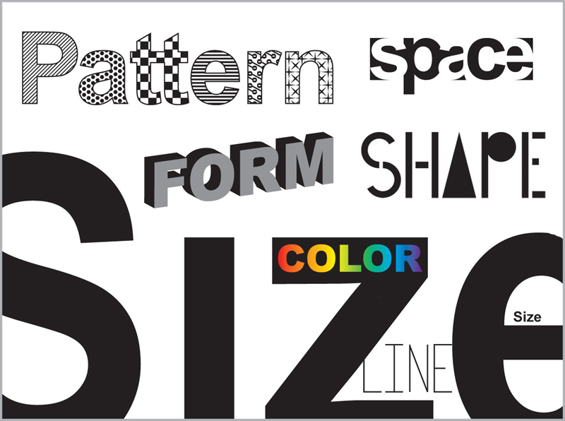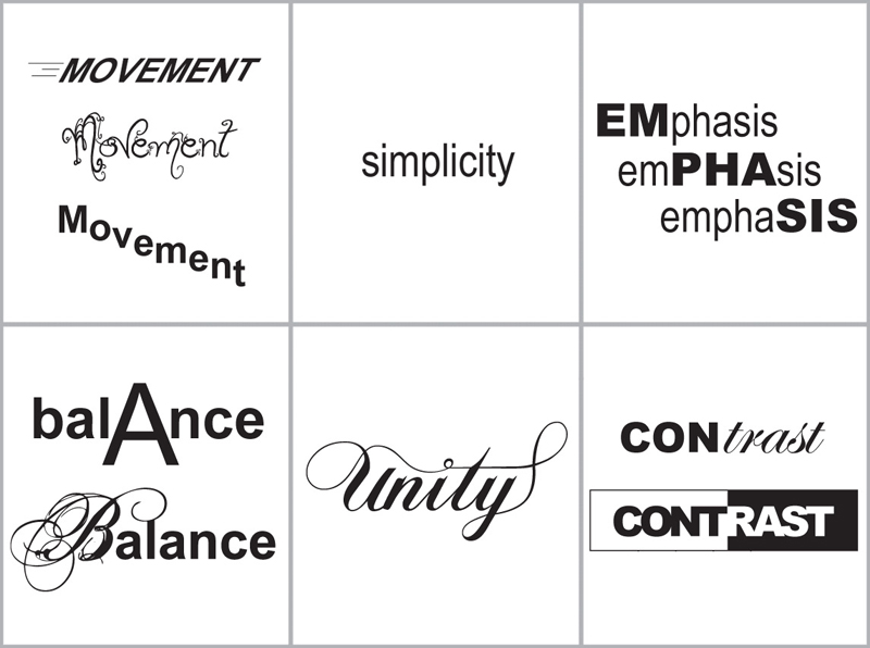

As a high school graphic design teacher, I felt the hardest thing to teach students were the basic principles and elements that make up good design. I created the following posters to put up in my classroom, illustrating each word so that it looks like what it means. After putting them up, I found my students understand the concepts better, and often used the language to critique their own work as well as the work of classmates.


