Principles and Elements of Design, Typography – Adobe Illustrator (2011)
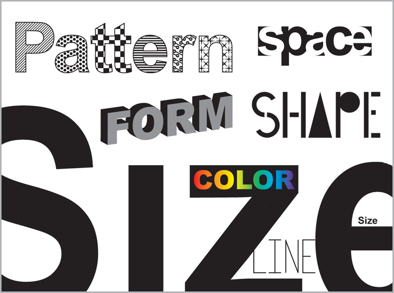
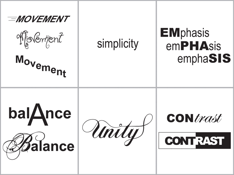
As a high school graphic design teacher, I find the hardest thing to get through to students are the basic principles and elements that make up good design. I created the following posters to put up in my classroom, illustrating each word so that it looks like what it means. Since putting them up, I find my students understand the concepts better, and refer to them often in their own designs.
Crystal Illustrations – Adobe Illustrator (2008) top
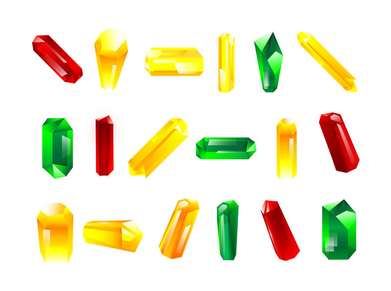
While working on the Stargate Worlds online game, I was asked to create crystals for one of the mini games that would be implemented.
Zara – Adobe Photoshop, Illustrator, and Traditional Drawings (2005) top
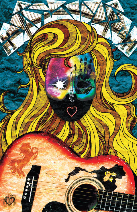
This illustration shows the life history and personality of my friend, Zara. Each part of the piece holds a particular meaning for her. When I was nearly done with it, I thought it looked too “pristine,” so I scanned some wrinkled aluminum foil and layered it over the top using an Overlay blending mode. This gives it a kind of “stained glass” effect.
Mining Company Annual Report, Typography – Adobe Illustrator and Photoshop (2005) top
While designing an annual report for a mining company, I found it hard to get photos or images to use, since most of what happens at a mine is either too dangerous for a “civilian,” or are considered trade secrets which cannot be photographed. To solve my image/photo dilemma, I created images using words that related to the mining industry.
Editorial Illustration – Sand Painting (2005) top
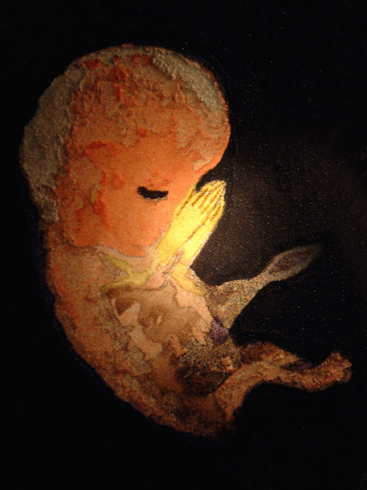
This image was created for a magazine article questioning whether religious tendencies are genetically inherited. This image of a fetus praying was created using colored sand for texture, then photographed to highlight the hands.
Photo-Realistic Marbles – Adobe Illustrator (2005) top
The goal for this illustration was to make it look like a real photo, even though it was done entireley in Adobe Illustrator (a vector drawing program that usually looks 2D and “cartoony”).
American Flag, Typography – Hand Drawn with Markers (2004) top
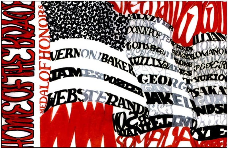
This image was created to honor Medal of Honor recipients from wars of the 20th century. The different conflicts make up the “background,” while names of some of the recipients make up the stripes in the flag. The field of stars in the flag was created using letters in the word, “veterans.”
Pencil and Conte Drawings – By Hand (2004) top
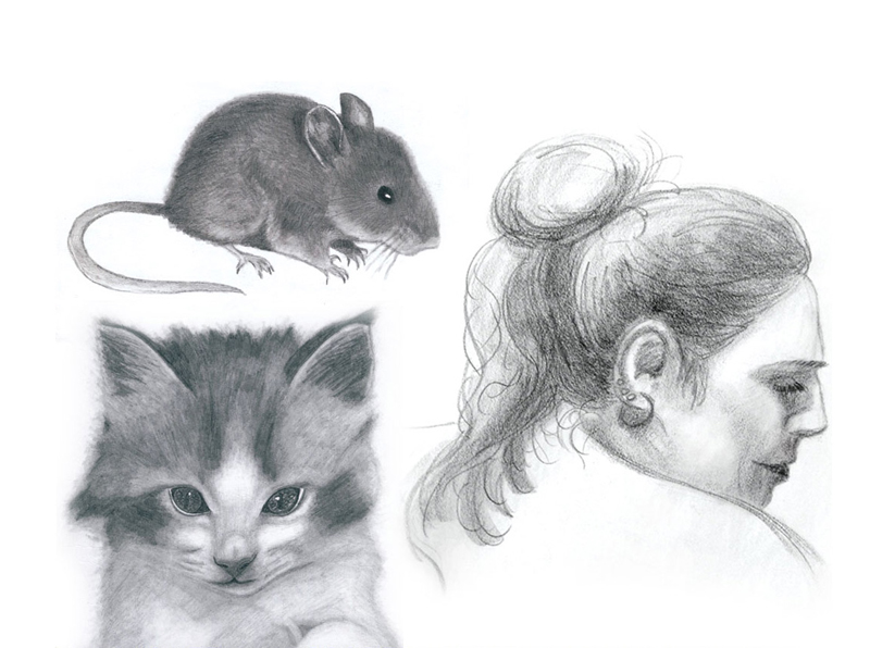
These are just a few of my drawings using graphite pencil and conte.


